

This is my fourth project as part of the Ironhack UX / UI bootcamp. The brief for this project ,To create a wellness app that will help the user track their progress and push them to commit to a healthier lifestyle.
Timeline : 9 days Team:Me and my classmate sukinah Tools Figma , Figjam , and Goggle surveys
A real problem for an imaginary client:
In this project, Ironhack presented us with a hypothetical client, The Daily Health Conference — a non-profit organization dedicated to promoting health and wellness. The challenge they faced was genuine: The Daily Health Conference had been slow to adapt to technology, resulting in a significant decline in memberships.
Solution
An app serves as the ultimate solution for individuals seeking to enhance their health and wellness journey. By providing personalized recipe recommendations, progress tracking tools, and streamlined access to nutritional information, users can effortlessly navigate their path towards a healthier lifestyle. With a user-friendly interface and tailored features, our app empowers users to make informed choices, stay motivated, and achieve their wellness goals with ease
What is already out there?
In order to create a compelling and user-centric nutrition app , a comprehensive understanding of the existing market landscape and user expectations is essential. As part of the design process for our project.
we conducted thorough competitive and feature analyses to gather insights, identify trends,to understand our position in the market a bit better and to get an understanding of areas of improvement through updating our knowledge to what is already tried and true.


Quantitative data
We conducted a survey on more than a hundred people The results highlighted that User preferences regarding smoothie ingredients, flavors, or nutritional content. Common challenges or frustrations users face when following a healthy diet or lifestyle, or when thay trying to find healthy recipes.

Qualitative data
For our qualitative research we asked 5 people who is interested in healthy life style to tell us more about their habits. All of them tend to frequently rely on diet and nutrition apps to track their eating habits and maintain a healthy lifestyle. However, they face challenges in finding recipes that align with their dietary preferences and nutritional goals. Additionally, some users encounter issues where the recipes they try turn out tasting weird.

User persona
We wanted to form a deeper understanding of our users’ goals, needs, experiences, and behaviors. So, we created a persona for our user segment. it was based on user interviews and surveys, and we kept updating it throughout the project as we gathered more data. We used this persona whenever we wanted to step out of ourselves and reconsider our initial ideas.
Let me introduce you to our committed professional Lina,who’s devoted to promoting health and wellness through nutritious food choices, seeks to expand the range of healthy options available at the sports club. With a keen interest in developing distinctive smoothie blends, she faces challenges in discovering reliable recipes and lacks access to a platform offering a wide array of smoothie-making features.

User Journey
Lena had to improve her diet and lifestyle to achieve her fitness goals. She searched online for smoothie recipes and wanted a progress tracking tool to monitor her eating habits and live a healthier lifestyle.

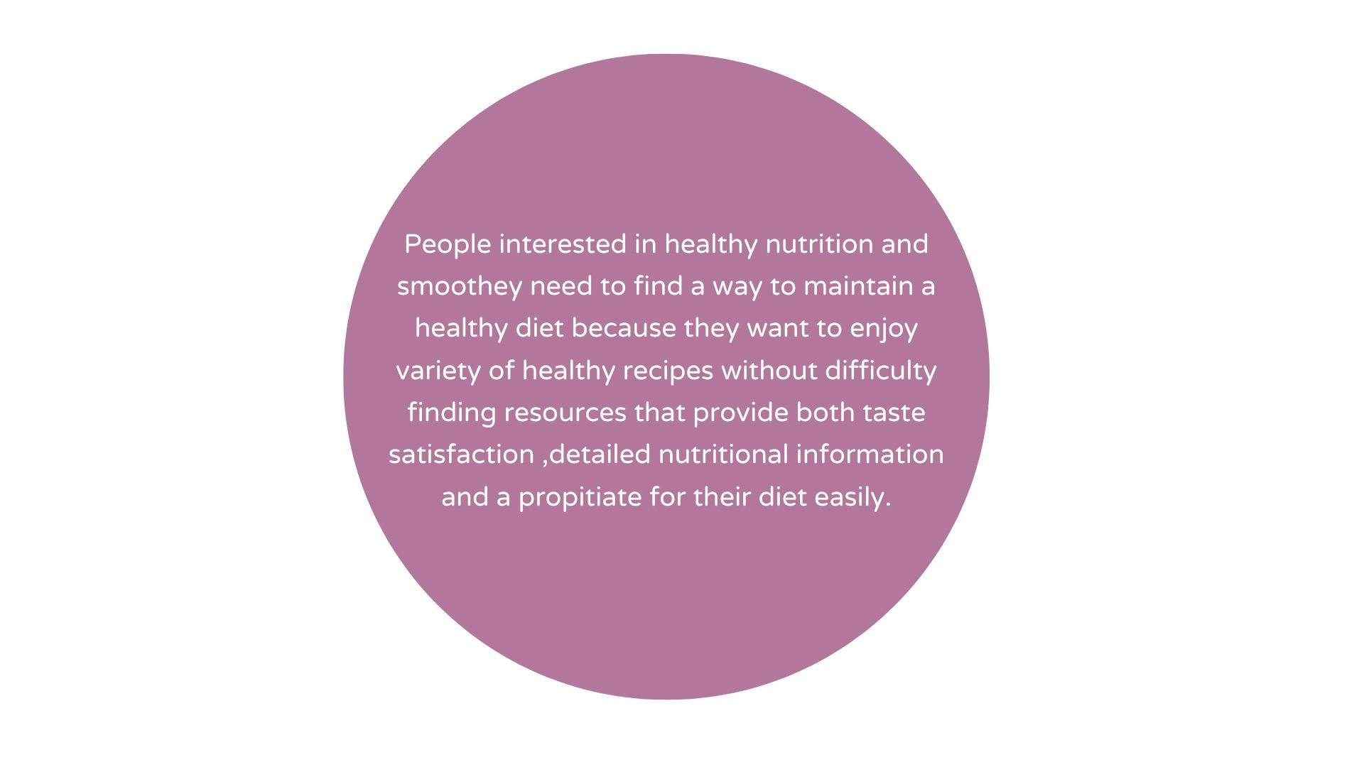
Problem Statement
Moscow Method & MVP Statement
The Moscow method is a powerful tool for addressing the features and organizing the essential elements of our mindfulness app. This approach prioritizes user needs and helps to streamline app design.so for the ideation! Where we came up with a lot of ideas and general concepts through crazy 8s while also bearing in mind the must haves ,should haves and nice to haves the Daily Health Conference provided us with.

Sitemap
At this stage we made a sitemap before we did anything else. Our sitemap allowed us to have a visual overview of what we wanted to incorporate in our app and conveyed the general idea for the information architecture as well.

User Flow

Low-fidelity Wireframes

As part of the development process for our app, we transitioned from ideation to the creation of low-fidelity wireframes. These wireframes served as the blueprint for our app’s interface, providing a basic visual representation of its layout and functionality.
To ensure that our design decisions were on track and aligned with user expectations, we conducted concept testing with three users. This involved presenting the wireframes to users and gathering feedback on their usability and effectiveness. We were pleased to find that all three users responded positively to the app, indicating that it met their needs and expectations.
Mid-fi wireframes

The introduction of mid-fidelity wireframes marked a significant step in our app’s design journey, enhancing its visual appeal and functionality. Through usability testing with three users, we validated our design decisions and received positive feedback on the app’s usability and user experience.
Visual competative analysis
By analyzing the strengths and weaknesses of these three apps, we can identify gaps in the market and design an app that offers unique features or a more user-friendly interface to stand out from the competition.This guided our design decisions, ensuring our app stands out and offers a superior user experience.

Moodboard and Brand attributes
Brand attributes are crucial for designing an app that aligns with our vision and goals. By identifying attributes such as Healthy, Fresh , Energetic , Organized , Compatible, we can create a cohesive visual identity that evokes the emotions we want our users to feel while using the app. we’ve curated a vibrant palette consisting of green, pink, and yellow hues. These colors evoke feelings of freshness, vitality, and joy, perfectly aligning with our app’s mission to promote health and wellness through drinking smoothies .

Style Tile
we’ve crafted a visual representation of our app’s design direction, showcasing elements such as typography, color scheme, and imagery. This style tile serves as a guide for creating a cohesive and visually appealing user interface that reflects the brand identity and resonates with our target audience

We were able to streamline our main elements like
Typography
Category cards
Icons for in app use and navbar icons
Colour pallete
Illustrations
Buttons
To work efficiently we invested time in making components to ensure coherency, flexibility and speed in our designing process.
High-Fidelity Prototype
The Hi-fi Interactive Prototype is the final product before launching the app, and it is important because it allows us to showcase the app’s full functionality and user experience.
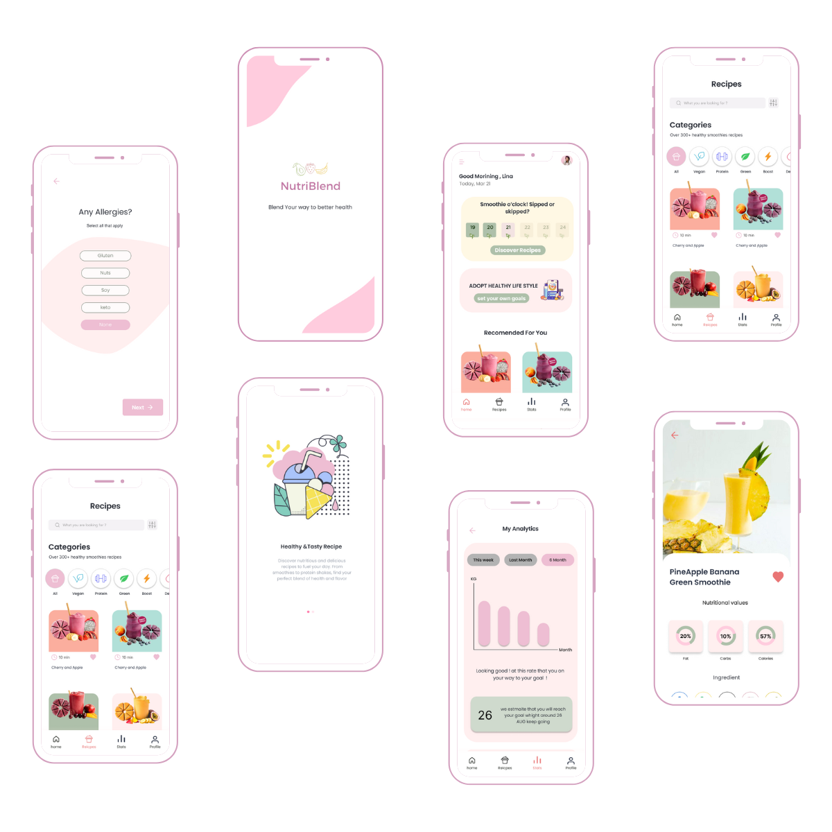
Prototype in action

Finally we conducted desirability testing in order to get qualitative data from the testers. Most of the users found the mobile application creative, fresh, motivating , simplistic and colors.
Next steps
“Integration of meal planning and grocery list management capabilities”
“Continuous innovation and iteration to enhance the user experience”
“Introduction of achievement badges, progress tracking rewards, and friendly competitions”
“Design the other sections, functions and data”
Conclusion
This was probably the most challenging and demanding project in the bootcamp, pushing us to apply all the knowledge we had gained in the past few weeks to create something we can genuinely be proud of.
The Ironhack bootcamp is almost done… there is only one final project left!